

Collaboration With Passion
 Rocket Records signing, Howard Paul
It was time for me to introduce the PMT machine, for the second time in my career!
Art Director David Costa was extremely well connected in the music business, and pop luminaries would visit us for a coffee most days.
 Elton John - Victim of Love 7" single
 Alan Price, Zero-G, G-Force and Matchbox 7" singles
 Alan Price - This is your Lucky Day 7" single
Project - Alan Price - 7" singles.
I would draw a portrait of Alan, or draw Jamboree Bag items! I loved using the airbrush, and mastered it in a primitive way, compared with the professional artists that I would later employ on a regular basis!
We worked for many other record companies and music publishers, such as Jet, Riva, Magnet and DJM.
 Magnet Records A4 advert
 Don Black, New Musical "Dear Anyone" my illustrations
 Jet Records Christmas card
One time the song writer Don Black came and visited us with a script for a new musical titled "Dear Anyone".
Project - Yes - Tour Programme 1980
This was such a big event, that we were all enlisted to provide illustrations. David Costa, Myself, Hag (The Photographer ) and Jake Tilson.
 Yes Tour programme illustrations
 Unused drawing
All of us contributed illustrations for the songs and the presentation went to print.
Peter Gabriel - Tour of China 1984
Another time, Peter Gabriel needed a tour programme idea. I came up with the Little Red Book, and after showing a visual, Peter and I went shopping for reference material in China Town, Soho.
 Peter Gabriel Tour of China 1984 programme cover
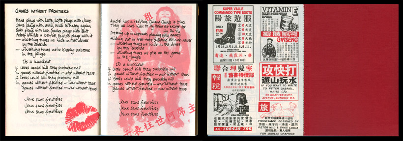 Peter Gabriel Tour of China 1984 programme sample inside spreads
 Elton John Back in the USSA programme
Project - Elton John - Back in the U.S.S.A. American Tour 1979
I designed the programme circular logo, as seen on Army Jeeps, and used it on every page! These tour programmes had a way of being put together in record time! We worked in conjunction with Mick Worwood, from the merchandisers Brockum International on many Tour Programmes. Sometimes we would do the artwork straight away, as we had typesetters next door and photo labs nearby. We would pull out all the stops to get the job done!
 Unused ideas for Brockum International
 Pink Floyd - The Wall - Programme cover and credit page.
From time to time we were asked to design and artwork a really urgent tour programme. The famous cartoonist Gerald Scarfe came in with all his illustrations and ideas, to brief us. The programme was for Pink Floyd - The Wall and it was the only time I ever slept in the office!
 Pink Floyd - The Wall - Programme inside spread
David would interview new photographers or illustrators or colour retouchers every week, and also send our portfolio all over London to be seen by other Art Directors.
 Two 7" visuals
 Elton John - A Single Man programme
Project - Elton John - A Single Man In Concert plus Ray Cooper, Tour Programme
David provided a fabulous, huge, Magritte style illustration, and I worked on "A Single Man" Logo. I used a soft brush and water colour paper. The typography inside was unusual for it's time as Linotronic Typesetting had only just started! I decided to make 3 font changes in every line. It still looks fresh 34 years on!
I worked on many albums, 7" singles, picture discs, adverts, calendars, Tour programmes and posters.
 The logos for A Single Man
 Elton John & Billy Connolly Tour badges
Project - Elton John & Billy Connolly
Billy Connolly opened for Elton John back in the late 70s and I provided one illustration for the tour programme and designed two badges shown here.
 Britt Ekland & Rod Stewart 7" singles
I provided an illustration for a Knebworth Concert in 1978 ( Oh God, Not Another Boring Knebworth... )
 Knebworth illustration unused
 Judie Tzuke Sportscar album
Many of the albums that we undertook to design had a photograph taken beforehand, probably for publicity purposes! We would then have to apply type as best we could. We might have to squeeze it in, across the top, or in a dark part of the photo .This was the case for the Judie Tzuke’s, Sportscar album, or the Chris Rea, Whatever Happened to Benny Santini? album!